Jack Wallen takes a look at the latest version of KDE Neon and comes away seriously impressed.

Image: Jack Wallen
If you ask most devoted fans, Widows 7 was the best iteration of the desktop operating system. It still held true to the look and feel users had come to rely on but gave just enough modernity to pull it out of the cold, out-of-touch grip of the software Grim Reaper. That's why, when Microsoft put the kibosh on Windows 7, the community at large was up in arms. They didn't want to let go of what was familiar and what worked so well for them.
SEE: 5 Linux server distributions you should be using (TechRepublic Premium)
I see KDE as holding the same spot for Linux users. This open-source desktop has been, for some time, the perfect marriage of old and new school design and execution. It's got all the goodness of the past, with just enough future flavor to make it feel like it's both familiar and modern at the same time.
It's because of that old-school feeling that I tend to not give KDE enough love. And that's a shame because if KDE Neon (and version 5.22.1 of KDE) has shown me anything, it's that this desktop deserves the attention and accolades it has missed for a while.
To resolve that oversight, I thought I'd spin up a virtual machine of the latest KDE Neon release and see what was what. I'm happy to report, I was quite pleasantly surprised. With the KDE Neon distributions, users are treated to the latest version of the KDE desktop and an operating system that runs incredibly smoothly. It's not perfect, but for anyone looking for the best introduction to Linux, this might well be the ideal choice.
Let's find out why.
It's all about the Application Launcher
Let's face it, the single most important piece of the desktop puzzle is the Application Launcher. Why? Because that's where users interact with the desktop; it's where they launch applications, search for various objects (applications and documents), locate settings, and lock/restart/shutdown their machines. If developers and designers take the wrong path with this particular feature, the UX will dramatically suffer. In fact, it's one of the biggest complaints you'll hear from users new to GNOME. Getting used to the GNOME Dash is a challenge for many user types. KDE? Not even remotely. The second you log into the KDE desktop, you feel immediately at home.
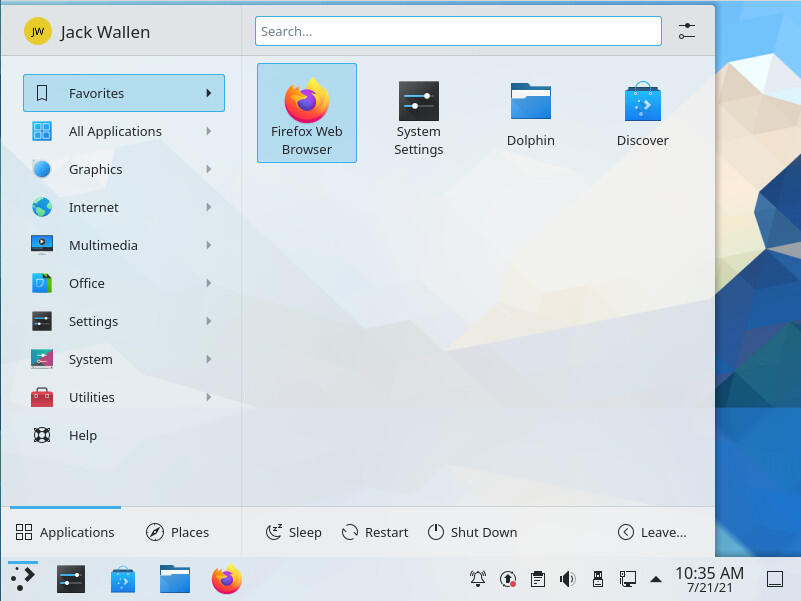
And then you click the Application Launcher and the "special" really kicks in. This is hands down, the best desktop menu on the market. It really is that good. And, yes, part of that reason is because KDE feels like the modernized version of the Windows 7 Start Menu, only if it were designed to function with a level of efficiency and user-friendliness the Microsoft designers and developers couldn't touch (Figure A).
Figure A

The KDE Application Launcher is the best on the market.
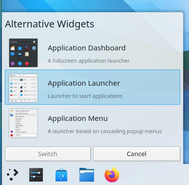
Even better, if you don't like the default Application Launcher (you will), you can always change it out for either an Application Dashboard or a standard Application Menu. To do this, Right-click the Application Launcher button, select Show Alternatives and choose from the options (Figure B).
Figure B

Selecting the type of desktop menu you want for KDE.
For those curious:
- Application Launcher is a hybrid between an App Overview and a standard menu.
- Application Dashboard is similar to what GNOME's Application Overview is.
- Application Menu is similar to the standard desktop menu.
For my money, the Application Launcher is the best of the bunch, because it gives you the best of both worlds.
KDE paired the options way back
Once upon a time, the biggest issue with KDE was that it had way too many features. The bells and whistles list had become a point of pride for the developers as if to say, "We have more features than any desktop available." Unfortunately, that was to KDE's detriment. This is especially so when the developers themselves couldn't explain a feature well enough that made sense to the users. There was one particular feature (which I cannot recall the name of) that allowed you to group widgets and windows into categories, like a supped-up version of Workspaces. But the way KDE deployed and managed the feature was about as confusing as one could make it.
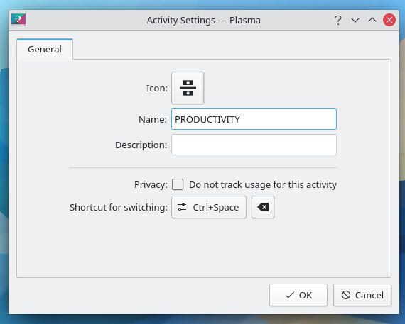
The latest KDE defaults to Activities, which is another name for Workspaces. KDE takes this a step further and allows users to create custom Activities and even allows for the enabling/disabling of activity tracking for a new Activity (Figure C).
Figure C

Creating a new Activity in KDE.
Granted, most average users aren't going to hop on board the Activity train. They should. Workspaces has been a feature I've made use of in Linux since the early days, and it makes it incredibly easy to efficiently handle desktop organization.
Widgets, widgets, widgets
One thing KDE did retain was Widgets. For those who aren't in the know, these widgets are exactly what they sound like. Similar to those found on the Android platform, widgets are small applications, added to the desktop, to make interaction with the interface even easier. By default, you'll find widgets like various menus, audio volume, battery and brightness, calculator, various clocks, Bluetooth status controller, color picker, clipboard, calendar, dictionaries, storage usage, folder views, puzzles, display configuration, global menu, activity viewers, and more. Personally, I've never been big on desktop widgets, mostly because I prefer my work environment to be minimalist. But for anyone who prefers adding small applications and such, KDE Widgets will be a welcome treat.
SEE: Rust: What developers need to know about this programming language (free PDF) (TechRepublic)
The experience makes it
To try and sum up what KDE Neon delivers is challenging, especially when breaking it down to its constituent parts. Why? Because the KDE experience is about the sum of the whole. The latest iteration of KDE is a glorious desktop that finds all of its pieces working in perfect harmony. Within every nook and cranny of the desktop environment, you'll find something new and exciting that was clearly (and meticulously) designed to work seamlessly with everything else. Nothing is out of place and everything just works.
That's how special KDE (and KDE Neon) is. I highly recommend you give this desktop Linux distribution a go and just try not to fall in love with it.
Download your copy of KDE Neon now.
ubscribe to TechRepublic's How To Make Tech Work on YouTube for all the latest tech advice for business pros from Jack Wallen.

Open Source Weekly Newsletter
You don't want to miss our tips, tutorials, and commentary on the Linux OS and open source applications. Delivered Tuesdays
Sign up todayAlso see
- Linux 101: How to execute commands from within the nano text editor (TechRepublic)
- Linux 5.14 kernel: New and exciting features coming to the release (TechRepublic)
- How to become a developer: A cheat sheet (TechRepublic)
- Kubernetes: A cheat sheet (free PDF)(TechRepublic)
- Could Microsoft be en route to dumping Windows in favor of Linux? (TechRepublic)
- A guide to The Open Source Index and GitHub projects checklist (TechRepublic Premium)
- How open source-software transformed the business world (ZDNet)
- Linux, Android, and more open source tech coverage (TechRepublic on Flipboard)


 English (US) ·