Android 12 beta: My experience so far
Jack Wallen has been using the Android 12 beta for a few weeks now. Find out what he thinks of the pre-release version of the newest Google mobile platform.

Jack Wallen has been using the Android 12 beta for a few weeks now. Find out what he thinks of the pre-release version of the newest Google mobile platform.

Image: Google
I'm not gonna lie, the second the Android 12 beta program opened, I enrolled my Google Pixel 4. It's not my daily driver, so I wasn't concerned with things going wrong. That's a pretty good road to take, as with beta releases things do go wrong.
However, something interesting has happened with my experience so far—things haven't gone wrong. Not big things, not deal-breaking things. In fact, many days during this beta period, I've seriously considered enrolling my Google Pixel 5 into the program. Then common sense takes hold and reminds me that Murphy's Law is still at play with this release, and thus, I refrain.
Even so, my experience so far with Android 12 beta has been stellar.
Allow me to elaborate.
SEE: Electronic communication policy (TechRepublic Premium)
It's all about Material You
I've said it before, and I'll say it again, Google has done something very special with Android 12. Material You is remarkable. Understand, this could be in part because the Android UI has felt stuck in a fairly deep rut for some time. Material Design has needed a deep refresh and Google has finally delivered.
Material You is more than just a prettified UI. The interface moves with a grace and style Android has never enjoyed. Animations feel truly animated. Elements on the display come alive with energy and "pop." For the first time, Android feels as if it's truly responding to input and not just "phoning it in."
Beyond the look and animations, there are so many little things the developers have done to make Android more effective and efficient. Let's take a look at some.
Power menu
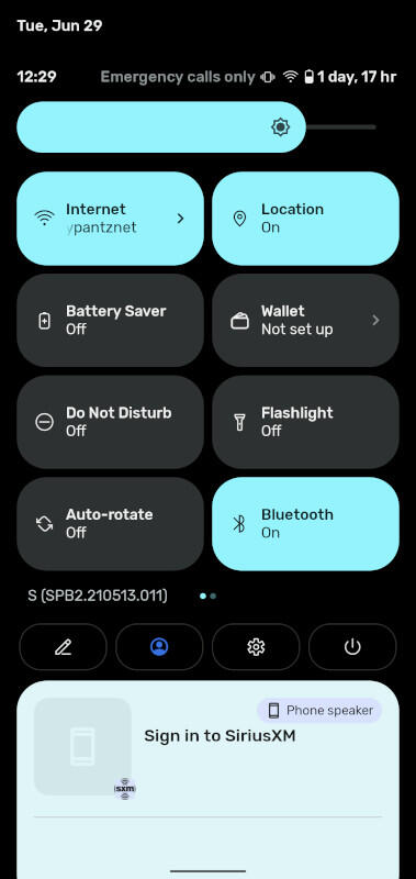
This is a new feature I appreciate. Previously, to access the Android power menu, you'd have to long-press the power button. That's all fine and good (and not even remotely hard), but I want something more integrated with the UI—Android 12 brings that into being. Drag the Notification Shade down twice to reveal a power button (Figure A).
Figure A The Android 12 power entry in the Notification Shade.
Tap that button to reveal four buttons, for Emergency, Lockdown, Power off and Restart (Figure B).
Figure B The Power entries are accessible from the Notification Shade.
You can access that same menu by long-pressing the power button, but I find the Notification Shade method easier.
Speaking of which…
Google Pay Wallet
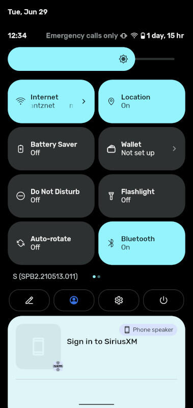
It never made sense to me to have the Google Pay Wallet feature in the Power menu. It looks as though my confusion made its way to Google, and they've migrated the Pay Wallet to a Quick Settings Tile (Figure C).
Figure C Google Pay Wallet is now even easier to access.
Notifications
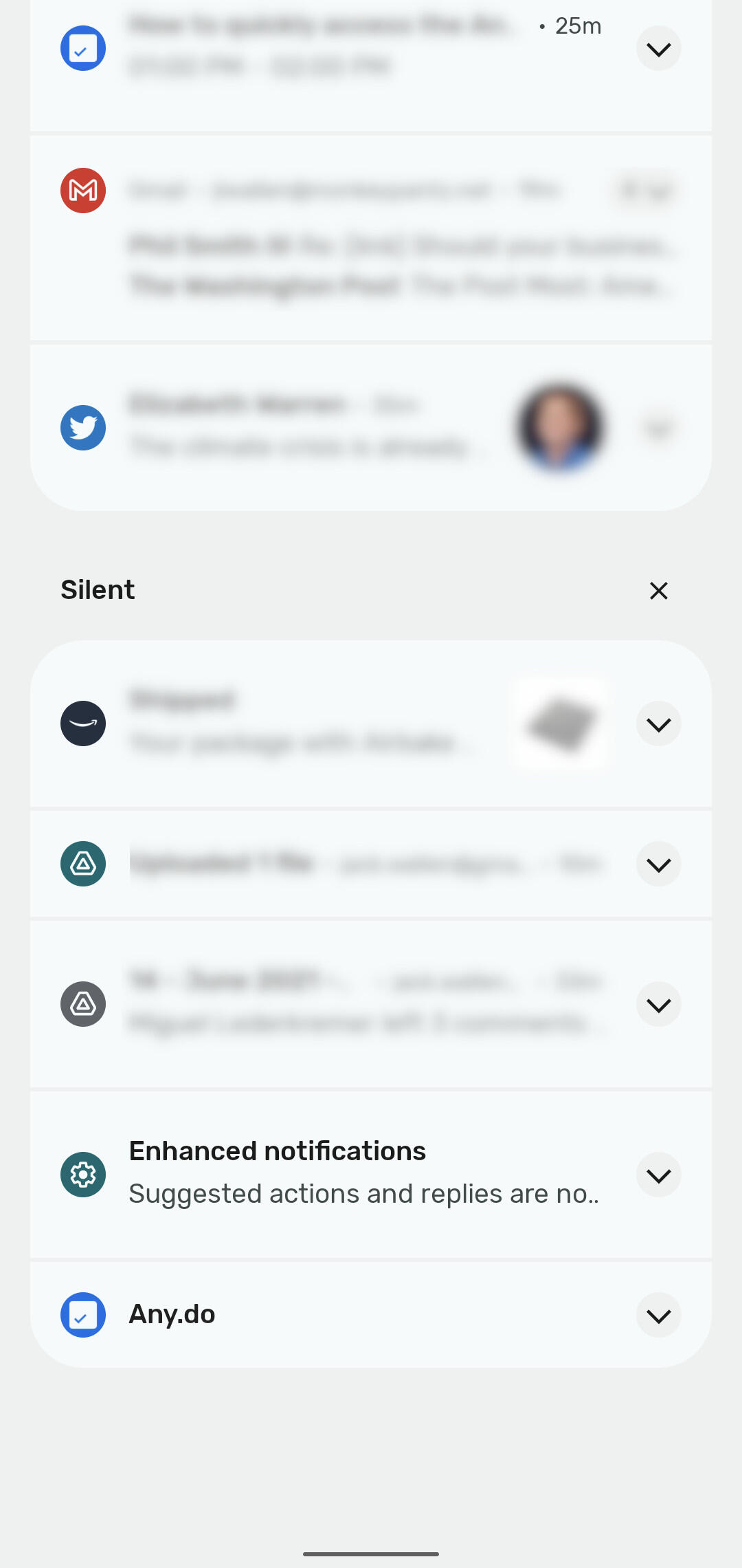
Although this could be lumped in with the Material You, notifications are considerably easier to read. Part of this has to do with the rounded edges that separate the groups of notifications (Figure D).
Figure D The rounded edges make the demarcation between different notification groups clear.
There's also a clarity to the font found in Android 12 that wasn't quite there in previous iterations. That clarity comes through in the notifications.
Another addition to the notification makes using the Shade even easier. Say you receive an email and it appears in the notifications. In previous incarnations, you could expand that notification (to read more than just the sender and subject) by tapping the associated downward-pointing arrow. With Android 12 you can simply pull down a bit more on that notification to expand it. This makes the action of reading those notifications more natural. Instead of scroll and tap, you can simply scroll and scroll. It's a cleaner, more efficient method.
Performance and battery life
Overall, I feel the performance of the Pixel 4 has vastly improved with Android 12. As I mentioned earlier, animations spring to life like they're ready to pop out of the display. Apps also open and respond considerably faster than they did with Android 11.
Even more important, the battery life is considerably better. That's saying quite a lot. One of the biggest issues with the Pixel 4 was the poor battery life. With Android 12, the battery life has improved enough that the phone can finally make it through the day without desperately gasping for breath as it drains that last bit of juice.
No, the Pixel 4 battery still won't keep up with the Pixel 5, but that's comparing apples to oranges given the Pixel 5 has a much beefier battery. Even still, that Android 12 makes a noticeable difference in the battery life of a device known for not making it through the day should give you an indication as to what it'll do for a device that doesn't suffer from the same hardware issue.
Conclusion
Android 12 has impressed me more than any other iteration of the platform. It's an absolutely gorgeous UI that makes perfect sense and performs flawlessly. I highly recommend, if you have a spare Pixel phone laying around, that you enroll it in the beta program and experience the upcoming Android release.
I'm enjoying the beta release so much, I'll have to keep warning myself to not install it on my Pixel 5 (at least not until August...or maybe mid-July...or maybe next week).
Subscribe to TechRepublic's How To Make Tech Work on YouTube for all the latest tech advice for business pros from Jack Wallen.

5G and Mobile Enterprise Newsletter
5G networks and devices, mobile security, remote support, and the latest about phones, tablets, and apps are some of the topics we'll cover. Delivered Tuesdays and Fridays Sign up today
Also see
How to use the Android Photos Locked Folder feature (TechRepublic)
The Android 12 Privacy Dashboard is an at-a-glance permissions tool (TechRepublic)
Wi-Fi 6: A cheat sheet (TechRepublic)
5G: What it means for edge computing (free PDF) (TechRepublic)
IT expense reimbursement policy (TechRepublic Premium)
Smartphones and mobile tech: More must-read coverage (TechRepublic on Flipboard)
What's Your Reaction?


.jpg)
.jpg)